
APIS; AirInsight
Last year was tough for any US industry that depended on ‘foreign’ visitors. Here are some charts that show the patterns of what happened. Our source data is the DHS APIS, otherwise known as the I-92.
Over the past four years, US traffic abroad has exceeded inbound visitor traffic. In 2025, that remained true, but traffic volumes dropped off.
Take AirInsight for a Test Flight
7 days full access — premium analysis and the complete data model library — for $1. No commitment.
Start My Test Flight →
Inbound Visitors
But, as always, the devil is in the details. Take a look at the table below. Let’s focus on visitors and ignore US citizens. At first glance, it looks awful with a lot of red. The calculation is arrivals minus departures. A green number indicates that more arrivals than departures occurred.
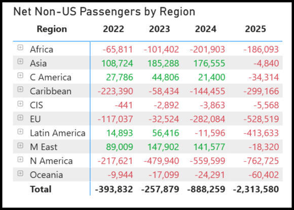
2025 was all red- non-Americans left the country in droves. Let’s go down a layer into the top 15 visiting countries.
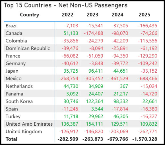
A swath of red, and two greens for 2025. Bad news? Well, yes, but there’s more to it than 2025 clearly.
Most countries in the red for 2025 have been there for years. There were spikes in 2025 across the UK, Mexico, Germany, and France. You would have thought Canada would be the worst, given the media coverage. But no.
Americans going abroad
When looking at Americans traveling abroad, the logic is reversed. Green indicates that arrivals exceed departures, i.e., there is a net return of Americans from abroad. And what do you know? As visitors fled the country, US citizens returned in droves.
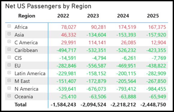
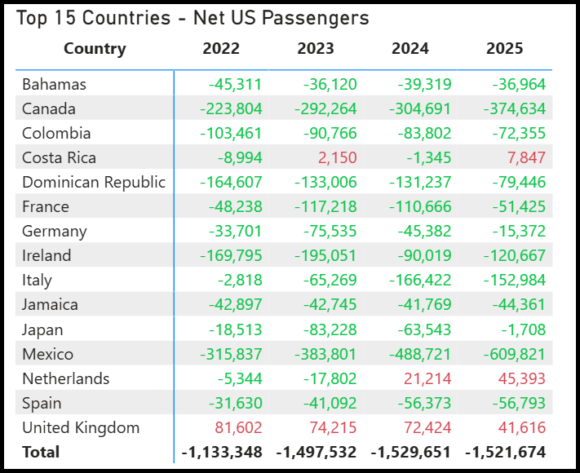
Here’s the breakdown for the 15 countries for Americans. And again, we see a net flow in the opposite direction to that for visitors.
Summary
Our readers are typically from within the industry, so if you’re from an airline, this part is especially for you. Airlines are less concerned with the direction of the flow, as long as load factors are high (with good fares).
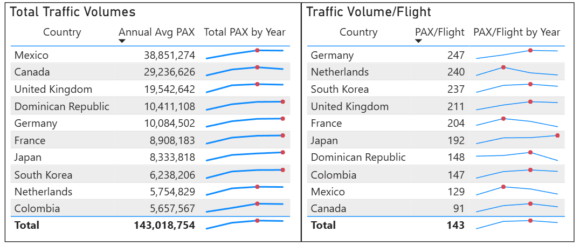
The red dots are the high points. The left chart shows that several markets reached high points in 2025. The right chart indicates that some flights may need capacity recalibration.
In summary, traffic softened last year. But it mostly followed a trend set before, so there should have been no surprise.
Views: 202
About The Author
Take AirInsight for a Test Flight
7 days full access — premium analysis and the complete data model library — for $1. No commitment.
Start My Test Flight →




Hi Addison. Is the top right chart US passengers? They both have the same NON US name but different scale on the Y axis.
Jessica, you’re absolutely right! Typo has been fixed, thank you.