

With April data published in the US DOT On-Time dataset, we want to introduce new metrics to help understand the state of the US airline industry.
These metrics are going behind the paywall — but we’re sharing them here first to show you what’s inside. Most aviation coverage tells you what happened. We explain why, with data. If that’s useful to your work, subscribe here.
Context
It is important to recognize the scale of the US airline industry. The following table achieves that. The data is for the first five months of 2026. Red is poor, and green is good. The colors are relevant to each other. Any delay is suboptimal, and here’s an item for consideration: the industry average cost per minute is $110. Ponder that metric for a minute as you look at the amount of delay minutes. The total lost value is quite alarming.
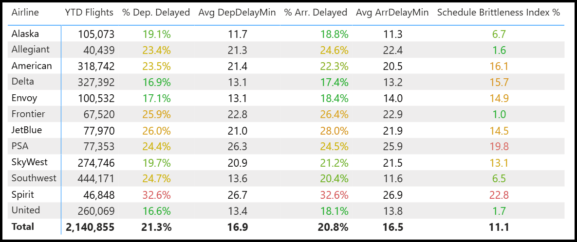
Most of the metrics are self-explanatory. Let’s explain this new one: ‘Schedule Brittleness Index’ – How likely a schedule is to fall apart once disrupted. Specifically: % of aircraft-days that experience multiple disruptions or cancellations after an initial disruption.
- Overall: 11.1% of disruptions lead to cancellation or diversion.
- Best (most resilient):
- Alaska: 6.7%
- Southwest: 6.5%
- United: 1.7% (very strong)
- Worst (most brittle):
- Spirit: 22.8%
- PSA: 19.8%
- American: 16.1%
Key Nugget: Low-cost carriers are at both extremes (Southwest excellent, Spirit poor). Regionals such as PSA also exhibit higher brittleness.
Having provided an industry context, let’s dig into the other new KPIs.
Delay Propagation
“Delay Propagation” means that when a flight is delayed, it often causes the next flights on the same plane (same tail number) to be delayed as well. This is like a domino effect in the airline’s daily schedule. Our DPF KPIs measure the severity of this domino effect for each airline.
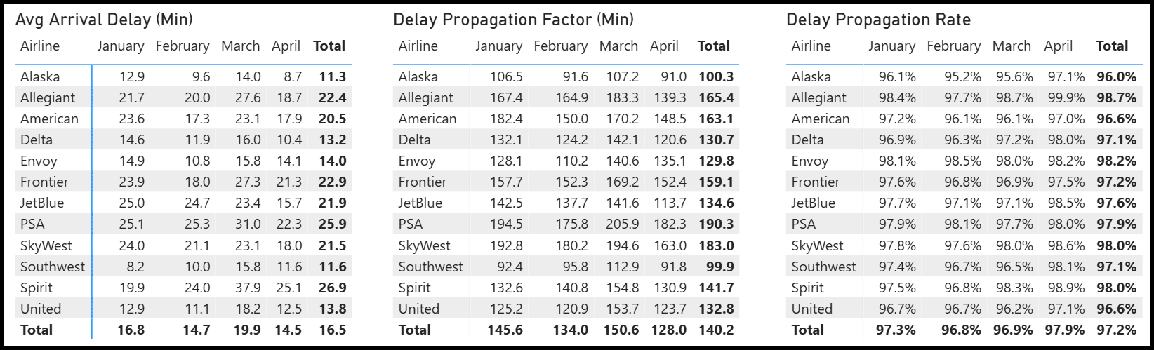
Delay Propagation Factor in Minutes – On average, how many extra minutes of delay does a disrupted flight cause for the rest of the day’s flights?
Example: Southwest ~100 minutes vs SkyWest ~183 minutes. Lower number = better (the airline contains the problem quickly).
Delay Propagation Rate – What percentage of the time does an initial disruption lead to additional problems (e.g., delayed arrivals or cancellations) later that day? Lower % = better (disruptions don’t spread as much). The third table makes this plain: an average of over 97% indicates almost zero recovery. Read that again — 97% of initial disruptions cascade into further problems the same day.
That in itself tells you a lot about the state of the industry. It’s one exogenous disruption away from trouble.
The three tables lay out the monthly performance. There is a lot of data to absorb here.
What does the data show us?
- The standard “on-time %” metric hides how well (or poorly) airlines recover from operational problems.
- High propagation = brittle schedules > more cancellations, crew issues, passenger misery, and higher costs.
- Low propagation = resilient operations > better reliability for passengers and asset utilization for lessors/OEMs.
This is why Southwest often ranks well — they have more slack in their schedule and recover faster.
Bottom Line
We continue to seek deeper insights from industry data. This is an example.
On-time percentage is a lagging indicator. It tells you what happened, not why — and it says nothing about whether an airline contains the damage when something goes wrong. Schedule Brittleness and Delay Propagation answer that question.
United’s 1.7% brittleness score and Southwest’s sub-100-minute propagation factor aren’t accidents; they reflect deliberate operational architecture. Spirit’s 22.8% and SkyWest’s 183-minute propagation factor reflect the opposite. The cost is real: at $110 per minute delayed, resilience isn’t a passenger-satisfaction metric — it is a P&L metric for the next quarterly earnings call.
Views: 114