2023 01 16 08 56 09
That monstrously huge data source, the DB1B has been updated through 3Q22. Here are some highlights available to subscribers.
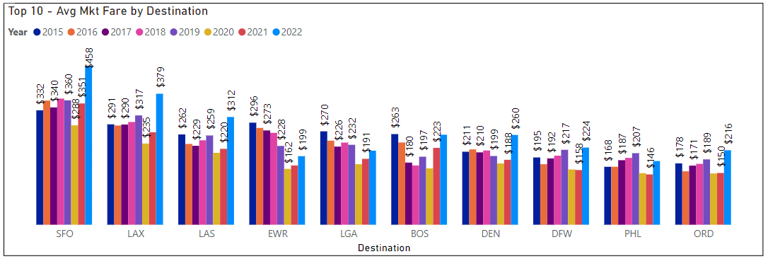
Fares jumped in 3Q22. The traffic recovery pushed demand, and given a pilot shortage and airline schedule shrinkage, something was going to give. That give came from travelers’ wallets. These are the top 10 – check the fares to SFO; the average fare is up a~$100 (30%) in a year.
Take AirInsight for a Test Flight
7 days full access — premium analysis and the complete data model library — for $1. No commitment.
Start My Test Flight →
Readers can try our DB1B Market model below. Page 2 is a lot of fun. Select the airline type and then click the “play” button at the bottom left to see the evolution. Readers can even type in an origin airport code to drill down – the eraser to the right clears your selection. Note that clicking any airline’s circle allows you to see the history. Hover a mouse over the circle and the data behind that location details are shown. The big item to see here is the sharp rise in fares for 3Q22.
Page 4 highlights this, too – showing the fare rise despite anemic traffic growth. The schedule shrink and pilot shortage combine to give airlines a huge revenue boost. Softening fuel prices only serve to add to net revenue.
Another useful source of seeing how the US air travel market is moving is the DB1B Coupon dataset. This model allows a reader to evaluate each airline.
Take a look at Breeze to see how its traffic has grown steadily. As a new entrant trying to win traffic without attracting competitive attention, this is always going to be an interesting airline to watch. Note also how this airline’s average stage length is growing. If Airbus gives Mr. Neeleman the extra fuel tanks in the A220-300s, we can expect that to grow rapidly.
Page 2 of the model provides more insight into traffic flow from origin to destination and shows airline market share. As a mature market, one does not expect to see big shifts, and yet there are some significant shifts.
Views: 17
About The Author
Take AirInsight for a Test Flight
7 days full access — premium analysis and the complete data model library — for $1. No commitment.
Start My Test Flight →


