2019 05 30 14 21 18
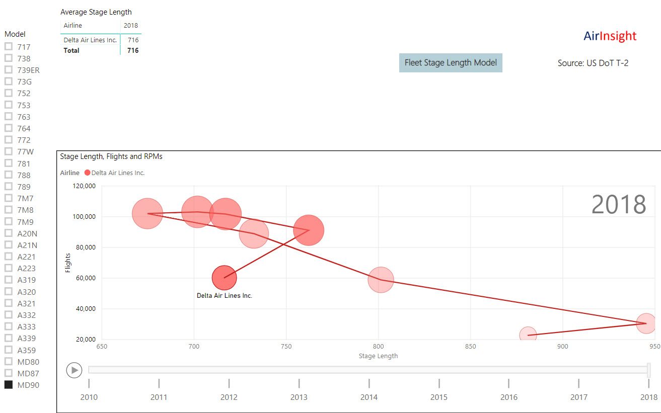
We have published another model. This one allows a reader to see how the US airlines (Majors and Regionals) have deployed their fleets. The model shows average stage length and combines this with the number of flights over the period 2010 to 2018. Clicking the play button allows the model to work through its data and show the reader how things change over time. We will update the model with fresh data as DoT publishes their numbers. Currently, the data reported is through November 2018.
It is remarkable how the airlines change the way their fleet is deployed. One might have thought that in a mature market things would be rather stable. No it isn’t!
Take AirInsight for a Test Flight
7 days full access — premium analysis and the complete data model library — for $1. No commitment.
Start My Test Flight →The image below shows how Delta’s MD-90s have seen average stage length change – a click on any balloon shows the movement over time in addition to the model “playing. This helps because there is a lot of movement in the model as it plays. Readers select the aircraft they want to watch from the list on the left. On page two we show the same data but from the perspective of an airline’s fleet – we do allow you to select between single-aisle and twin-aisle as well. Page three shows the regional airlines.
Views: 130
About The Author
Take AirInsight for a Test Flight
7 days full access — premium analysis and the complete data model library — for $1. No commitment.
Start My Test Flight →


Thanks a lot for this. Very interesting and informative.
Is Stage Length calculated as sum of flown distances divided by number of operations (landing)?
Most people assume Stage Length to be equal to ASK/sum of deployed seats! What does number of seats has to do in average stage length?
Appreciate if you can shed some light on this.