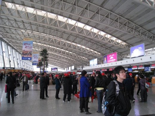
Xian Airport
Before COVID or politics, there was a lot of air traffic between China and the US. This chart provides a good overview of the strange market dynamics that are playing out.

In 2019, there were 4.3 million passengers. By 2024, the number had dropped to 1.1 million. Note the decline in flights. DHS data shows a 77% decrease in non-stop flights to the U.S. (2019 v 2024) and a 74% decrease in non-stop passengers from China (2019 v 2024).
Take AirInsight for a Test Flight
7 days full access — premium analysis and the complete data model library — for $1. No commitment.
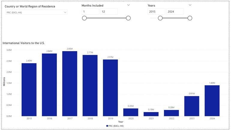
Start My Test Flight →Surprisingly, the number of visitors from China arriving in the United States only declined by 45%. This suggests many Chinese travelers opted for flights with one or more stops before arriving in the U.S. Politics aside, the recovery in the volume of non-stop flights and passengers from China to the U.S. has been slow compared to other international travel to the U.S.
The following chart shows annual Chinese visitors to the U.S. by air (PRC excluding Hong Kong).

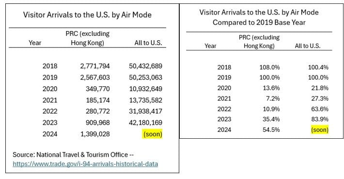
For more perspective, see these two tables. The left table shows a much sharper decline in traffic in China-origin than the market overall. The right table highlights the slower Chinese recovery.

The changes in the market can be somewhat unpacked from the following charts.

Using 2019 as the “normal” year, US flag airlines offered 39% of the flights and carried 36% of the traffic. Then we start the pandemic, and the data goes way out of line. US flag airlines kept serving the market, but almost no Chinese used these flights. Chinese carriers were far more active in this vastly shrunken market.
The following chart supports this assessment.

Chinese airlines saw a traffic recovery, while US airlines did not see much traffic of Chinese origin. Because of the disruption the pandemic wrought, the data shows odd flows. A few people traveled via Spain, South Korea, and Australia, and a few traveled via Switzerland on private jets.
The model below allows readers to select a Chinese-origin airport and monitor average flight loads. Choosing a US port of entry fixes a specific route. As the chart shows, load factors look good.
Average loads exceed those of a typical 252-seat United 787-9. By comparison, an Air China 777-300ER seats 311 and 270 and produces a load factor of 87%. Selecting the tile at the bottom left provides average loads by airline flag.
Going through each Chinese port of departure shows how some markets ceased and others recovered. For a wild ride, see WUH – this is Wuhan airport. The US selection drops to only two US ports of entry, meaning Wuhan has two US routes.
What could be driving these changes? China is seen as a market with great promise for air travel. The changes we see have implications for US airlines serving this market.
Views: 541
About The Author
Take AirInsight for a Test Flight
7 days full access — premium analysis and the complete data model library — for $1. No commitment.
Start My Test Flight →


